Motivation
test
“Page Build Warning” email
These days, some of you must receive a “Page Build Warning” email from github after you commit happily. Don’t Worried! It just that github changes its build environment. View Live Hux Blog
In this mail, github told us:
You are attempting to use the ‘pygments’ highlighter, which is currently unsupported on GitHub Pages. Your site will use ‘rouge’ for highlighting instead. To suppress this warning, change the ‘highlighter’ value to ‘rouge’ in your ‘_config.yml’.
So, just edit _config.yml, find highlighter: pygments, change it to highlighter: rouge and the warning will be gone.
Boilerplate (beta)
Want to clone a boilerplate instead of my buzz blog? Here comes this!
Post Test
from datetime import datetime
from __future__ import division
import pandas as pd
from pandas import Series,DataFrame
from pandas.io.data import DataReader
import numpy as np
import matplotlib.pyplot as plt
import seaborn as sns
sns.set_style('whitegrid')
%matplotlib inline
end = datetime.now()
start = datetime(end.year - 1,end.month,end.day)
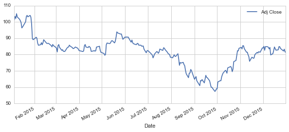
s = DataReader("BABA",'yahoo',start,end)
#s.ix['2015-12-24']
s.head()
| Open | High | Low | Close | Volume | Adj Close | |
|---|---|---|---|---|---|---|
| Date | ||||||
| 2015-01-05 | 102.760002 | 103.019997 | 99.900002 | 101.000000 | 18337000 | 101.000000 |
| 2015-01-06 | 101.250000 | 103.849998 | 100.110001 | 103.320000 | 15720400 | 103.320000 |
| 2015-01-07 | 104.589996 | 104.739998 | 102.029999 | 102.129997 | 11052200 | 102.129997 |
| 2015-01-08 | 102.949997 | 105.339996 | 102.680000 | 105.029999 | 12942100 | 105.029999 |
| 2015-01-09 | 105.239998 | 105.300003 | 102.889999 | 103.019997 | 10222200 | 103.019997 |
s['Adj Close'].plot(legend=True,figsize=(10,4))
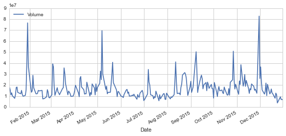
s['Volume'].plot(legend=True,figsize=(10,4))
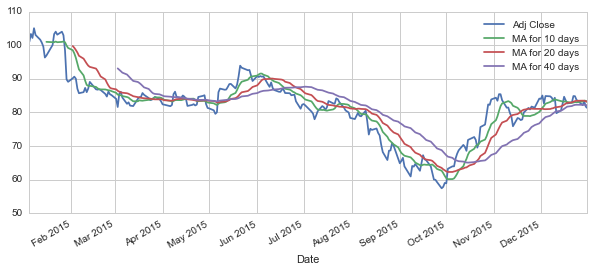
ma_day = [10,20,40]
for ma in ma_day:
    column = "MA for %s days" %(str(ma))
    s[column] = pd.rolling_mean(s['Adj Close'],ma)
s[['Adj Close','MA for 10 days','MA for 20 days','MA for 40 days']].plot(subplots=False,figsize=(10,4))
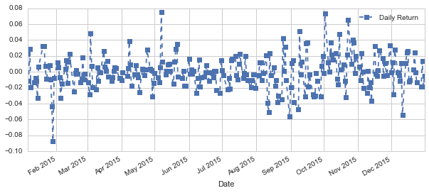
s['Daily Return']=s['Adj Close'].pct_change()
# print s['Daily Return']
s['Daily Return'].dropna().plot(figsize=(10,4),legend=True,linestyle='--',marker='s')
print s['Daily Return'].mean()
print s['Daily Return'].std()
-0.000642374946063
0.0213393676909
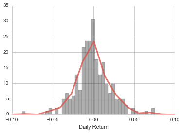
sns.plt.xlim(-0.1,0.1)
sns.distplot(s['Daily Return'].dropna(),color='0.2',bins=40,
             kde_kws={"color": sns.xkcd_rgb["pale red"], "lw": 3,
             "bw": 0.2,"alpha": .8})
# sns.kdeplot(s['Daily Return'].dropna())
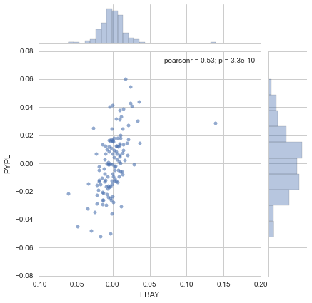
close_df = DataReader(['BABA','EBAY','AMZN','PYPL'],'yahoo',start,end)['Adj Close']
close_df['AMZN'].plot()

pct_df = close_df.pct_change()
sns.jointplot('EBAY','PYPL',pct_df,kind='scatter',joint_kws={'alpha':0.6})
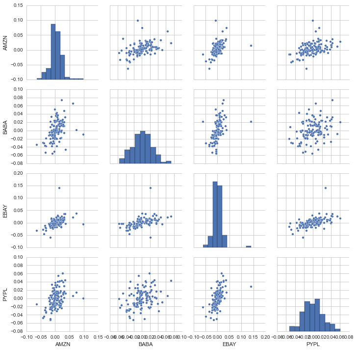
sns.pairplot(pct_df.dropna())
close_df1 = DataReader(['BABA','EBAY','AMZN','YHOO','WMT'],'yahoo',start,end)['Adj Close']
pct_df1 = close_df1.pct_change()
with sns.axes_style('darkgrid'):
fig, ax = plt.subplots(figsize=(6, 6))
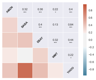
sns.corrplot(pct_df1.dropna(),annot=True,
cmap=sns.diverging_palette(230, 20,sep=50,
n=7,as_cmap=True))
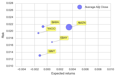
risk_df = pct_df1

plt.ylim([0.01,0.028])
plt.xlim([-0.005,0.01])
plt.xlabel('Expected returns')
plt.ylabel('Risk')

plt.scatter(risk_df.mean(),risk_df.std(),alpha=0.5,
            s=close_df1.dropna().mean(),label='Average Adj Close')
plt.legend(loc=1)

for label, x, y in zip(risk_df.columns, risk_df.mean(), risk_df.std()):
    plt.annotate(
        label,
        xy = (x, y), xytext = (30, 10),
        textcoords = 'offset points', ha = 'left', va = 'bottom',
        bbox = dict(boxstyle = 'round,pad=0.3', fc = 'yellow', alpha = .5),
        arrowprops = dict(arrowstyle = '-', connectionstyle = 'arc3,
        rad=-0.1'))
risk_df['BABA'].quantile(0.05)
-0.032540597138561403
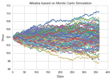
days = 365
dt = 1/days
mu = risk_df.mean()['BABA'] # drift of expected return
sigma = risk_df.std()['BABA'] # volatility of stock
def stock_monte_carlo(start_price,days,mu,sigma):
price = np.zeros(days)
price[0] = start_price
shock = np.zeros(days)
drift = np.zeros(days)
for x in xrange(1,days):
shock[x] = np.random.normal(loc=mu * dt, scale=sigma * np.sqrt(dt))
drift[x] = mu * dt
price[x] = price[x-1] + (price[x-1] * (drift[x] + shock[x]))
return price
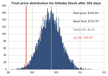
start_price = 103.94
for run in xrange(100):
plt.plot(stock_monte_carlo(start_price,days,mu,sigma))
# plt.plot(s['Adj Close'])
plt.xlabel("Days")
plt.ylabel("Price")
plt.title('Alibaba based on Monte Carlo Simulation')
# Set a large numebr of runs
runs = 10000

# Create an empty matrix to hold the end price data
simulations = np.zeros(runs)

# Set the print options of numpy to only display 0-5 points from an array to suppress output
np.set_printoptions(threshold=5)

for run in xrange(runs):
    # Set the simulation data point as the last stock price for that run
    simulations[run] = stock_monte_carlo(start_price,days,mu,sigma)[days-1];
# Now we'lll define q as the 1% empirical qunatile, this basically means that 99% of the values should fall between here
q = np.percentile(simulations, 1)

# Now let's plot the distribution of the end prices
plt.hist(simulations,bins=200)

# Using plt.figtext to fill in some additional information onto the plot

# Starting Price
plt.figtext(0.65, 0.8, "Start price: $%.2f" %start_price)
# Mean ending price
plt.figtext(0.65, 0.7, "Mean final: $%.2f" % simulations.mean())

# Variance of the price (within 99% confidence interval)
plt.figtext(0.65, 0.6, "VaR(0.99): $%.2f" % (start_price - q,), color='.4')

# Display 1% quantile
plt.figtext(0.65, 0.5, "q(0.99): $%.2f" % q, color=sns.xkcd_rgb["pale red"])

# Plot a line at the 1% quantile result
plt.axvline(x=q, linewidth=3,color=sns.xkcd_rgb["pale red"],alpha=.8)
plt.axvline(x=start_price, linewidth=3,color='.6',alpha=.6)

# Title
plt.title(u"Final price distribution for Alibaba Stock after %s days" % days, weight='bold');